Fur, scales, fins, or feathers, everyone has a story!
Well Groomed 11
Transcript
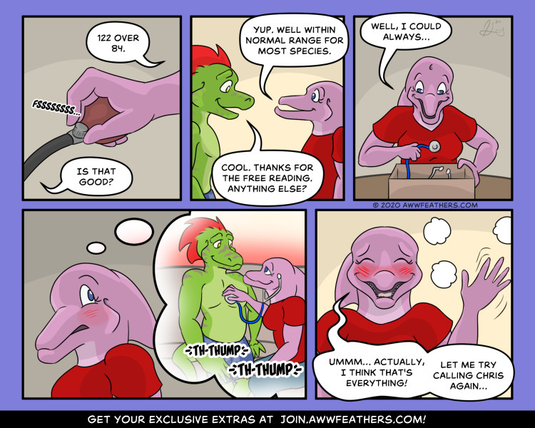
We see a closeup of June's hand, holding the bulb of the blood pressure cuff and opening the valve to let the air out. She says, "122 over 84." Ine asks, "Is that good?" We see the two of them sitting near each other as June says, "Yup. Well within normal range for most species." Ine smiles and says, "Cool. Thanks for the free reading. Anything else?" June rummages through her box of medical supplies and begins pulling out a stethoscope while saying, "Well, I could always…" She suddenly blushes slightly and imagines a scene in which she is pressing the stethoscope to Ine's bare chest and listening to his beating heart as the two smile lovingly at each other. Her blush deepens and she quickly waves away the imagined scene as it disappears in a puff of smoke. With an awkward smile, she says, "Ummm… actually, I think that's everything! Let me try calling Chris again…"
Lark says…
Behind the Scenes
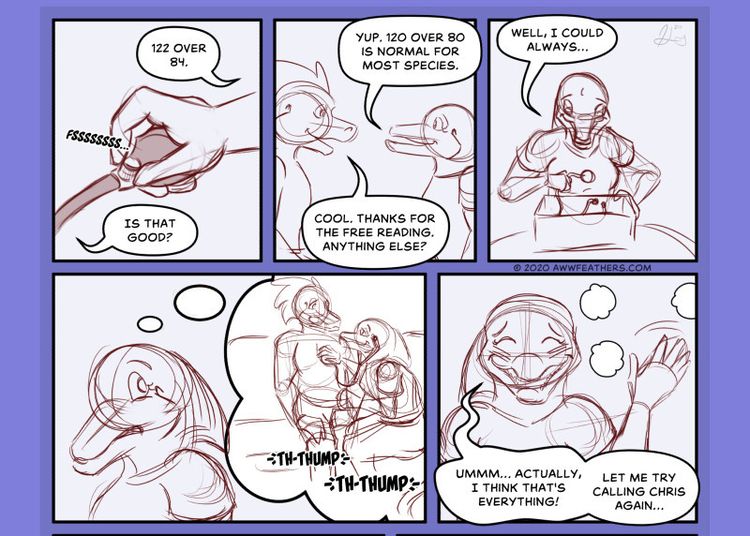
I finally figured out how to make June blush. Just have Ine take off his shirt! 😜 No seriously, I’ve had a difficult time showing characters blushing and getting it to look the way I wanted. There are a few ways to accomplish it, including adding colored hash marks or lines to the face just below the eyes, a solid area of darker color in the same area, or a softer gradient with a blurred outline. I settled on a hybrid approach with a blurred red area with some lines on top. I really like how it turned out! It kind of makes me want to rethink how I portray Ine blushing as well. For Ine, his stripes turn darker purple when he’s blushing, but it may be worth adding some red lines on top of that just to make it extra clear what emotion he’s feeling.
There’s a spectrum of artistic styles in comics ranging from toony to realistic. Aww, Feathers! falls somewhere in the middle, but definitely closer to the toony side. Still, it’s not as far to the toony side as, say, chibi style. The visual language of comics includes certain symbols and icons that help communicate what a character is feeling. Colored stripes on the face to indicate blushing is one example, as is the sweat drop to show that someone is uncomfortable or embarrassed, a throbbing vein to show anger, a small cloud coming from the mouth to indicate a big sigh, etc. They’re useful, but the more liberally symbols like this are used, the closer the art style feels to the cartoony end of the spectrum. To be clear, there’s nothing wrong with that if that’s the style one wants. It’s just something to be aware of when making decisions about how to visually communicate with your audience. June waving away the thought bubble in the final panel is another example of straying further into toony territory, and I had to think about whether it fit the overall tone I want for my comic or if it was going too far. In the end, I kept it because it communicates that she’s trying to hastily dismiss a potentially embarrassing thought. I try to keep instances like this relatively few however so they have a greater impact when I do use them.
This page was supported by these awesome Awwthusiasts!
Become an Awwthusiast today!
• Kirsten Schull
• Matthew Whiting
• Mary Sperry
• Little Fox
• Jim
• Bradley Korth
• Dan McNeece
• A T
• Pikminpedia
• Alexis Cheynas
• James Austin
• Raymond Turing
• Ash Carso
• Gary Scarborough
Published: Mar 2, 2021
Now it’s June’s pulse that’s rising…